What are typography and font styles?
A typography is the style and appearance of arranging font to be legible, readable and appealing when used. The arrangements of typography varies from the point sizes, line spacing, typefaces, and letter spacing. On the other hand, font style refers to the size, weight, colour and style of typed characters.
The importance of both are that they add emphasis to what is written and bring life to word, sentence, or phrase. Also, certain fonts are used for certain type of texts.
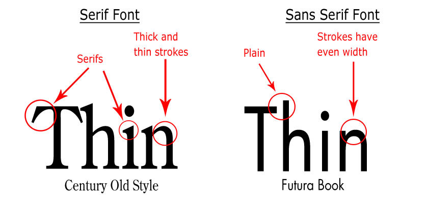
Difference between Serif and Sans Serif:
Serif fonts have details or small decorative flourishes on the ends, for example - Times New Roman. These types of fonts tend to look olden styled and are used in lengthy texts or formal writing.Also, serif font is used for printed work as they are easier to read in comparison to sans serif. This is because, serif font makes letters more distinctive therefore our brains recognise the letters quickly, whereas if they are not serif then the brain takes longer to identify each letter. Sans serif does not have these details or flourishes, for example - Arial. Sans serif font is mostly used on online on social media such as Facebook, Twitter, Instagram as it is simple and mostly associated with a younger audience.
Examples of sans serif fonts:

Examples of serif fonts:

Rap Magazine:
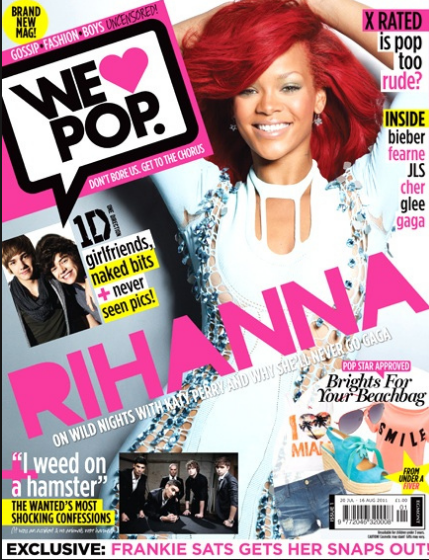
 The genre of this issue is Rap which is evident through the use of bold red and black font. As these colours are dark,they connote masculinity which indicates that the target audience for this magazine will be males. Also, the font is sans serif is more rough and masculine therefore suits the genre of the magazine.
Through my font type research, I have chosen 5 font types that I believe that will be conventional to the genre of Hip-Hop. Through the research and analysis of already existing Hip-Hop magazines, I came to the conclusion of using "True Lies" as I liked the sans serif, sharp lines effect. "True Lies" is a thin font in comparison to the others which are bold. Through the simplistic font type for my masthead, I will be able to use other elements within the magazine to get the audiences attention rather than attracting the audience through the masthead.
All these fonts were found on DaFont.com
No comments:
Post a Comment